Upgrade. Enhance. Evolve.
Luxury fragrance meets intelligent deodorant technology.
VAEV sits between advanced skincare and premium fragrance. Clean, minimal, architectural. We do not compete on being natural — we compete on being superior. Premium performance, intelligent formulation, evolving scent, industrial precision.
- — Preserve clear space equal to the height of the V.
- — Reproduce in Stark White on Pure Black wherever possible.
- — Use the original dark mark on Stark White backgrounds.
- — Maintain a minimum width of 64px on screen.
- — Treat the mark as a considered object, not decoration.
- — Never rotate, stretch, or outline the mark.
- — Never apply color, gradient, or drop shadow.
- — Never place over busy imagery without a scrim.
- — Never pair with secondary typographic lockups.
Designed to be kept.
Body copy is set in Inter Light with generous line-height. Labels and meta are uppercased at 10–11px with 0.25em tracking. Restraint carries the voice; density is a failure mode.
- Upgrade. Enhance. Evolve.
- Intelligent formulation.
- Ceremonial. Adaptive. Considered.
- A daily ritual.
- Designed to be kept.
- Natural. Clean. Green.
- Eco-friendly. Sustainable.
- Chemical-free.
- Wellness journey.
- Disruptive.
Low-key lighting. Single directional source. Matte surfaces on reflective stone. The object is always the subject; skin and lifestyle are secondary. No warmth, no filters, no clutter.
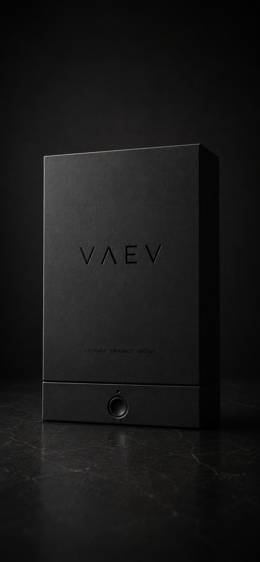
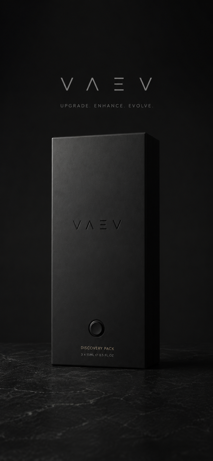
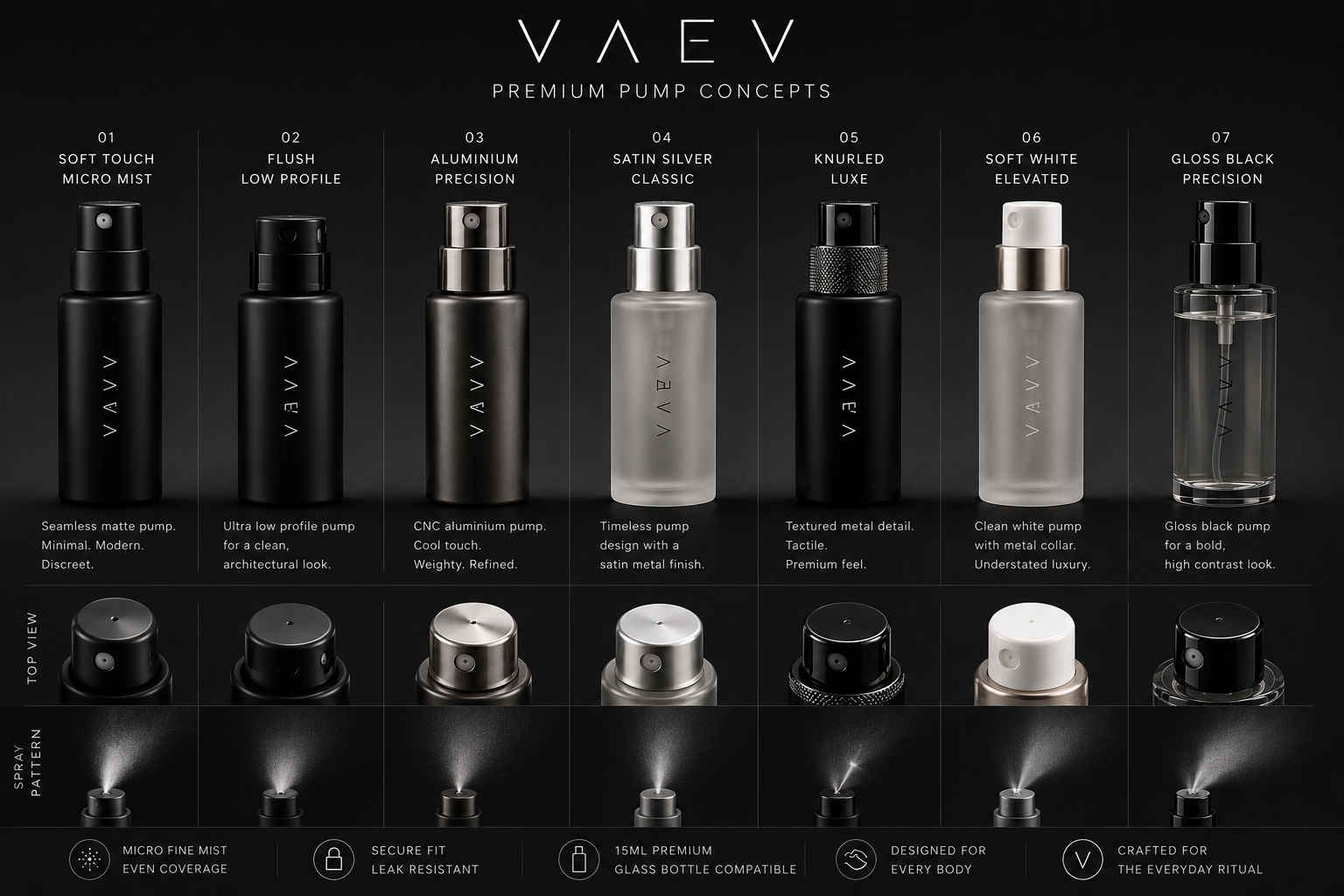
Ceremonial. Reveal. Adapt.
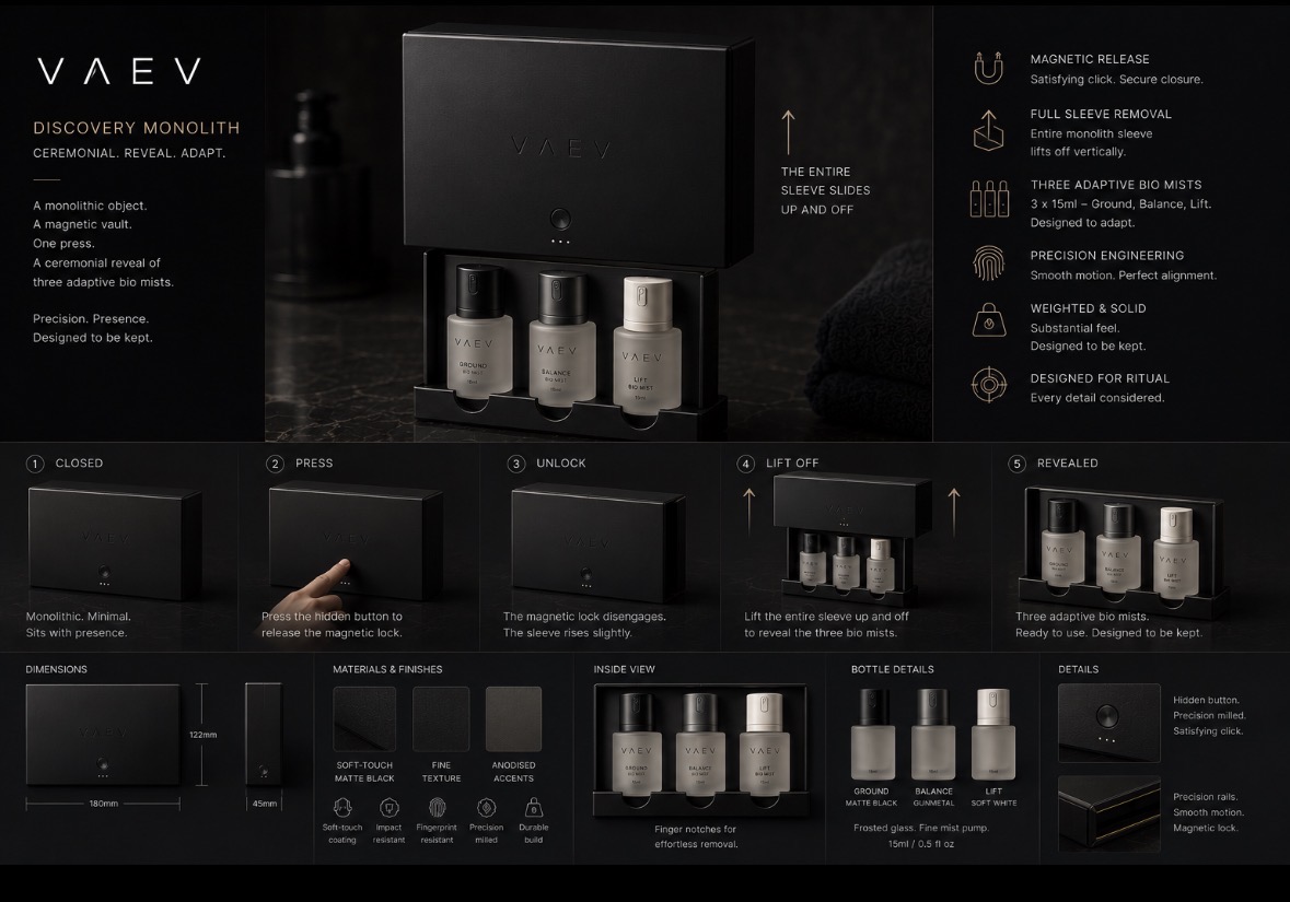
The Monolith is a magnetic vault. One press. A ceremonial reveal of three adaptive bio mists. Soft-touch matte black, fine texture, anodised accents, embossed mark. Precision milled, magnetically closed, designed to be kept.
25–45. Already spends on premium fragrance and advanced skincare. Reads ingredient lists. Notices packaging. Early adopter without being loud about it. Values craftsmanship, intentional design, and rituals that feel distinct.
- ByredoLifestyle aesthetic
- Le LaboBrand authority
- AesopRetail restraint
- Salt & StoneCategory adjacency